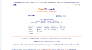
http://www.findsounds.com/
 I used FindSounds.com to search for accurate sound effects in the sequence. Here I could legally download from a vast variety of different noises, and locate an effective sound to accompany the images on screen. After deciding which scenes were in need of a diagetic or sometimes non-diagetic sound, I composed a simple list of 3 sounds effects.
Sound effect 1:
Computer beep
Non-diagetic
Needed in the opening title sequence to represent the sound of a hacked-in-to-computer.
Is heard while the words, "THE HACKER" is on screen.
Sound effect 2:
Disk ejecting
Diagetic
Heard as CD containing valuable information is ejected.
Sound effect 3:
Glasses breaking
Diagetic
Represents the anger of the Antagonist and his ambition to chase the Hacker.
Is heard as glasses theoretically hit the ground, and is combined with the change of shot to the escaping Hacker.
Potentially I could have recorded the sounds myself, yet I felt FindSounds.com, with the benefit of being quick and easy, offered a wider variety of much crisper sound files. In many ways it also seems a benefit to exaggerate sounds in a film, increasing the overall impact of the piece.
Font Research
My intention is to achieve a simple, easily-read font that reflects the nature of the film; fast paced, exciting, rugged and in link with the computer theme. I used DaFont.com to experiment with a variety of fonts.
'Traveling Typewriter' (top) was one I felt connected largely to the concept of typing and thus computer hacking. It's narrow letters are like those produced by a typewriter, and so it's not hard to imagine the font typing letter by letter on the screen, as seen in the 'Lock, Stock and two smoking Barrels' sequence I annotated.
'Ghetto Marquee' (second down) is similar in its untidy grittiness to the first font. The individual letters are boxed off (seperate as if also typed), in capitals, and are dirty and urban in style. I felt this font attained a degree of aggression and excitement found in the sequence but lacked the needed connotations of computers.
'Neuropol' (third down), unlike the others is tidily alligned with smooth edges. I discovered it when searching the 'science-fiction' section of the website. Although it lacks the urban ruggedness of the other fonts it appeals to the computer-hacker side more. I feel it definitely lacks the impact of the last font, and perhaps its letters are too thin to stand out on the moving-image backdrop.
'Impact' (bottom in box) is the font I am leaning towards the most in using in my final sequence. There are several reasons for this:
- The font maintains aggression, ruggedness and a contemporary style, which are in line with the moving image itself.
- The font maintains the computer connotations. The letters are smooth enough and alligned properly enough to relate to the electronic and technological aspects of a computer system.
- Impact, namely, has Impact. Its capital letters are bold enough and large enough to stand out on the screen.
- The font is easily accessable in video editing software (final cut) and MS Paint for my logo. Fonts that could be argued to be superior in this situation are not present in the software.

No comments:
Post a Comment